 Since the internet is filled with various infographics and other visual representations of data, it might be easy to think that the concept of displaying data in creative visual ways is a new phenomenon. It’s not. Though the easy flow of information that is possible on our modern day internet has helped to make this kind of data representation popular, it was also used to great effect in the past.
A fairly well-known example of this is W.E.B. Du Bois’s Data Portraits: Visualizing Black America (available on its own, and it is also given nice treatments on Brain Pickings, Smithsonian Magazine, and Public Domain Review) gave us beautiful colorful diagrams that strived to represent the lives of African Americans. The data portraits were presented at the 1900 Paris Exposition by Du Bois himself and displayed statistics and other information in creative ways.
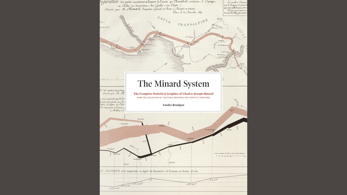
 Perhaps less well-publicized these days are Charles-Joseph Minard’s map of Napoleon’s 1812 march into Russia and his many other statistical graphics. A new book, The Minard System: The Complete Statistical Graphics of Charles-Joseph Minard by Sandra Rendgen, brings together all of Minard’s graphics, including the Napoleon march map. (Many consider the Napoleon map to be one of the most fantastic data graphics ever created.) Anyone interested in history, maps, or how information is displayed will find this book fascinating. (My Googlings on this matter also take me to Edward Tufte, who brought this graphic to the attention of the general public. And now I am about to lose myself for a month in his website. But I digress. Back to Minard!)
 Charles-Joseph Minard was a French civil engineer during the 1800s. He felt driven to create visual representations of the data he encountered in his work. The most famous of those, Napoleon’s march into Russia, demonstrates very clearly just how drastically, over the six months of the march that are covered in the graphic, Napoleon’s army diminished. Minard’s representation of this demonstrates not only the route Napoleon took but how his army shrank as he went. It depicts space and distance as well as numbers. Out of 420,000 men who initially invaded Russia, only about 10,000 survived. But what has come to be known “The Minard System” is only one of his many maps and visual representations of statistical data. This book, The Minard System, brings all of them together in one place.
 Minard lived through a time of very fast and significant change. The advent of the railroads and the Industrial Revolution, along with the creation of the new science of statistics, drove people like Minard to organize and make sense of the data that was pouring in. In addition to Napoleon’s march, Minard created graphics showing quantities of meat sent to Paris, English coal exported in 1860, Russian railroad travel in 1863, travelers passing through Grenoble Junction, and how many hours of Latin were studied in Stuttgart high schools. This book, this catalog of his work, covers 1825 to 1870. His visual types included flow maps, diagrams, charts, and other types of maps, including those using proportional circles. Each of his graphics is accompanied by text, captions, and a translation that explain what you’re looking at, which is helpful because Minard’s works are notated in French.
 The full sheet of paper that hosts the Napoleon map includes more than just the march into Russia. The same document also includes Hannibal’s march over the Alps, where we see a similar decrease in his army’s size. And, since the book’s documents are included in chronological order, this full document is included nera the end of the book, since Minard drew it closer to the end of his life. Perhaps it is so well regarded because, by the time he drew it, he had a lifetime of experience to inform his style and methods.
 In addition to his complete body of work, the book also includes an overview of Minard’s life and career, a background of drawing and mapping for engineering, economic and statistical thinking of the period, how Minard’s work was received, and the areas on which his work had impact. One can get through the book’s text pretty quickly, but readers will spend much more time examining the images, reading the translations, and learning how clearly Minard was able to convey numerical information in a visual way.
The Minard System: The Complete Statistical Graphics of Charles-Joseph Minard is available now. If you’re a lover of visual data, I can’t recommend this book enough. Its large form factor allows for close study of Minard’s visuals, and the notations and translations that accompany each help put them into context.
Note: I received a copy of this book for review purposes but all rabbit holes, devotion to maps, and love of the visual are my own.


