Facebook is filled with memes consisting of artistically drawn words, either meaningful quotes, or the author’s own words, drawn as art in wall-hanging-worthy designs. Unless you have a natural artistic bent, these kinds of things can be hard to create in a vacuum. But there are some helpful books out there that take you through the process, step by step, and you’ll have your own artwork or Facebook meme in no time.
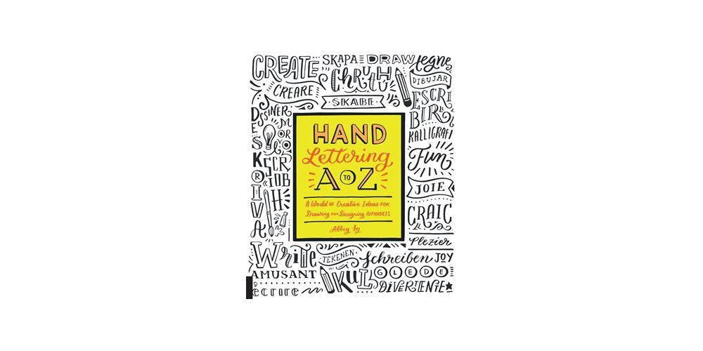
Hand Lettering A to Z: A World of Creative Ideas for Drawing and Designing Alphabets by Abbey Ly is a prime example. It takes the reader through all the tools and materials needed, how to evolve your letters, serif font ideas, sans serif font ideas, script ideas, embellishments, alternative letters, and applications, along with a gallery of some completed work as examples. As someone whose handwriting (printing) isn’t the most artistic or flouncy, and whose cursive is abysmal, I need this kind of guidance to turn my ideas into artwork. Hand lettering is not quite calligraphy, but it can be compared to it somewhat. A calligraphist friend described calligraphy as drawing letters, rather than writing in a fancy way (I’m paraphrasing). So I kept that in mind as I worked through the book.
Once I knew I’d get to review this book, I came up with an interesting quote of my own devising that I knew I’d want to turn into something pretty. I’m also horrible with paintbrushes and paint, so I knew I’d want it to be a pen and ink sort of thing. But, past that, I wanted to see where the book would take me.

What’s Inside
The book starts off by emphasizing that you don’t need to be an artist to create beautiful and creative lettering projects. She offers something for every skill level. This is good, as my skill level is pretty low. But I’m ambitious, so I thought I’d see what artistic havoc I could wreak.
As for supplies, I don’t have too many fancy things on hand, but I do have a sketchbook, good erasers, lots of mechanical pencils, a ruler, and a variety of widths of quality ink pens. This would be enough. I also knew that script lettering wouldn’t be my strong suit, so I would aim for a combination of serif and sans serif styles, with some weird stuff thrown in. The book encourages you to create your own alphabets, beginning with something simple, and building on it. But, as my problem is that I’m usually low on ideas but can implement and build on things I see, I knew I’d be mostly emulating others’ styles to begin. There would always be time for new ideas as I practiced. (It didn’t turn out this way, though; I did come up with a couple of original ideas.)
In the Serif chapter, the book goes into detail for a variety of serif styles, including a couple by some guest artists. The Sans Serif chapter does the same for sans serif styles. Many of the drawn words and sentences in this book are in other languages, such as Spanish and German, but does give translations. This adds to the fun, and subtly encourages a wider audience for your ideas.
Once you’ve got your lettering and word ideas down, the Embellishment chapter suggestions some ideas for banners, symbols, and flourishes to add to your piece. The book then goes on to suggest a few projects, such as creating custom artwork or a custom art journal or notebook cover. The gallery in the back shows other examples by a variety of artists.
Though the book does give step-by-step instructions for what it contains, it also serves as a collection of examples from which you can jump off to create your own styles and combinations. Find other styles out there in the wild (or on Facebook memes…) that you want to emulate. And then give it a try. Don’t be afraid to mix and match styles, colors, and patterns. I kind of went overboard with that.
It’s amazing what a little bit of line weight and a few extra markings can do to make a letter look fancy. The book definitely makes me want to try some brush pens, though. You can vary your line weight more easily with those than with a pencil or pen.
My Results

In the end, I drew much inspiration from the book’s styles and procedures, and went out on my own with a lot of things. My spacing needs some work, and a couple of the styles I chose I’m regretting, but I’m very pleased with my results in general, especially since it was my first ever time trying hand lettering. From start to finish, including the brainstorming stage, this probably took me about four hours. A fun investment in creative thinking.
Hand Lettering A to Z is available now, and I recommend it to everyone to wants to try their hand (see what I did there?) at turning words into art. I’ll be coming back to it again and again, trying out new techniques and quotes.
Note: I received a copy of the book for review purposes.