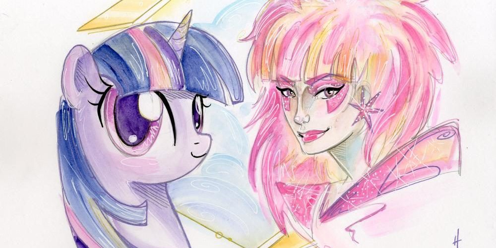

Whimsical. Surreal. Detailed. Sparkly. Honestly, if I had to find one word to use to describe Sara Richard’s work, it’d be sparkly. Despite not actually using sparkles in all her work, the detailed line work and the nuanced sketching incorporated into her brightly stylized artwork always feels as though it is sparkling with the reflected rainbows of diamonds. Despite the total hyperbolic poetry of that sentence, it really is true. The fact that Sara Richard’s art is the backdrop to my iPad screen simply because her work always makes me smile is the reason she is this week’s Superheroine Sunday profile.
Sara Richard creates art that mixes the muted tones of watercolors while retaining a vibrancy through her choice of colors. Within the larger pictures, the attention to detail incorporates patterns and details that draw the viewer into the work. Her art brings the reader into a thinking space by bringing details into what otherwise would be considered dead space. Instead of just coloring an area, Ms. Richard fills that area with information causing the viewer to engage thoughtfully. In some works, she brings in references to modern artists such as Picasso and Dali. She fills her works with so much beauty and detail that the recipient of the art becomes engaged on a level more than just the primary image.
Looking at some of her MLP art, she elicits a Day of the Dead aesthetic with some of the work. This particular aesthetic is newer to Ms. Richards’s portfolio. Much of her inspiration, she’s noted in interviews, comes from art nouveau and art deco, as well as Japanese ink paintings and Lisa Frank. Her website lists her inspirations as Margaret Macdonald and Charles Rennie Mackintosh, Alphonse Mucha, Tamara De Lempicka, Erte, Michael Parkes, Susan Seddon-Boulet, and Gustav Klimt.
Looking at Richard’s work, these inspirations are clear. The depth of detail in her works harkens to the art deco styles of Margaret Macdonald and Charles Rennie Mackintosh or Alphonse Mucha. Richard’s work abounds with small details between the larger strokes of illustration. Small dots, curlicues, and other rounded geometric patterns adorn the images. The long bold strokes of the primary images are often curved with few sharp edges breaking the sense of easy movement. This flowing style with huge swirls shows her love of Susan Seddon-Boulet. Her images often place the main figure in the middle of the page reminiscent of Alphonse Mucha. Her works include a focus on one or two characters front and center of the page, occasionally with periphery characters in the borders, but most often with the geometric details reminiscent of the art nouveau style.
Unlike the art nouveau styles, however, Ms. Richard incorporates bright colors that jump off the page. Although some of her works incorporate the sepia tones traditionally associated with Klimt or Mucha, many of her works pop with bright purples and red and blues. This is where she shows her love of Tamara de Lempicka and Lisa Frank.
However, despite being able to find characteristics of Ms. Richard’s inspiration in her works, the works are defined by her own sense of whimsy and humor. Reading through her website, Richard’s voice comes through clearly to visitors. At one point she writes, “I love comics, toys, cartoons, art history, anything nerdy: I will devour it like a fat kid at IHOP.” Her sense of humor and her pop culture references make me laugh every time I read the sentence. This sense of youth and whimsy comes through in her art. Despite the sophistication and depth of color and detail, Ms. Richard also includes this sense of fun. Her quick portfolio page, for example, contains images of the White Queen, who stares out from behind her hair almost daring the viewer to engage her.
Image 5 “Fashion in Action – Antje” incorporates all of the best of Richard’s work.

Antje dangles a cigarette between her open lips, her eyes closed in ecstasy. The colors pop with their bright pinks and purples and aquas. Then there are the flecks of white sparkle, their thin lines reaching across the thick black lines giving a sense of shining motion.
Her Wonder Woman, however, grasps my attention.
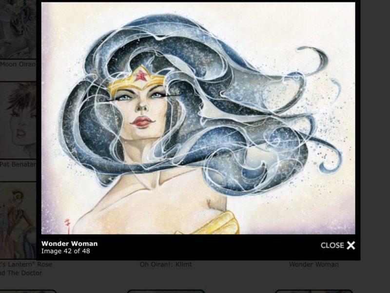
With Wonder Woman’s face slightly off the center of the frame, her hair flows all the way across the page. The rounded swirling image of her hair not only harkens back to Seddon-Boulet but does so in a way that creates a sense of motion and power. As Wonder Woman looks towards the sky, her shoulders squared against whatever she sees, the image evokes a sense of both power and hope. The art nouveau-esque details that epitomize the depth of Richard’s work are done through shading as opposed to use of shapes to do it. The fact that Wonder Woman’s face stands out as well shaded but also less ornate focuses her power in those details. The bright aqua of her eyes shows power in their upward stare. This image evokes power, femininity, and hope all at the same time. It is absolutely beautiful.
Cover artists, despite their work being on the covers, often have their names hidden inside the books. Therefore, we need to continue to remind ourselves,, as comics readers, that the heroes who create our books are more than the just the names on the outside, more than the story lines, more than the splash pages. They consist of the many different individuals who make these books reality. For the beauty of her art, the depth of texture in her work, and the sense of fun and whimsy in her images, Sara Richard is this week’s focus for Superheroine Sunday.
You can find Sara Richard’s work here and at Society6 here.