Dear Kickstarter,
First off, the good news. Big fan here. Seriously. I’ve backed 86 projects (so far) and most of them have delivered on their rewards. I can’t say I’ve had the same success rate with your competitors.
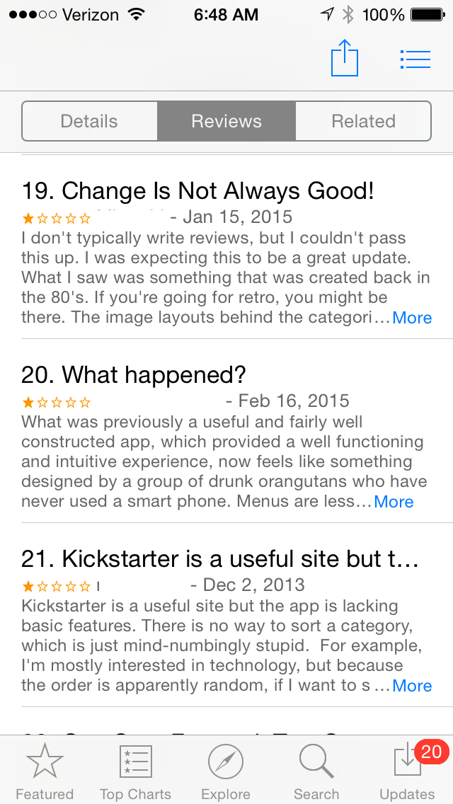
But now the bad news. Your app sucks. There’s no other way to say it. I have an iPhone and I’ve used your iOS app for quite some time now, but this latest version that appeared earlier this year? Just horrible. I’m sure there are some folks out there who like it–probably the same group that maintains the Jar Jar Binks Fan Club. Anyway… I digress.
How do I know the app sucks? The easiest answer is this one: the number of projects I have backed recently has dropped. Let me explain.
For the past two years or so, I’ve done 99% of my browsing and backing of Kickstarter projects from my iPhone. I rarely browse KS from my laptop or my iPad; I tend to look at projects in those rare moments when I’m waiting in line somewhere or during my sons’ soccer/baseball practices. When I receive a recommended Kickstarter project, it usually comes via email and I check my email most often on my phone. But since this newest interface was released, I am finding myself using your app less and less. I can easily go a week or so without browsing projects.
And since I’m on the topic of browsing, let me point out that browsing is my biggest issue with the app. There were two big changes you made that, in my opinion, broke your app:
1. Replacing the vertical scrolling when browsing already-backed projects with the left-to-right browsing, and
2. Changing the Search option by removing some of the popular categories for filtering.
On the first item, it’s just painful. Previously, I could see 4-6 projects on a single screen and quickly scroll down and find a backed project fast and easy. Now, it’s slow. One. At. A. Time. Just awful.

The second item requires just a little more explanation. I mainly back boardgames and hardware (tech). With the previous app, I could select the Games category and then filter out video games and select to view just boardgames. That’s gone bye-bye. And with Technology, I could filter on Hardware or Software or Open-Source… those have gone bye-bye too. What did you give us with the new app? Well, you still let us choose the high-up categories such as Food or Games or Technology, but these prime categories all now come with just five options–sorted by Magic, Popularity, Newest, Ending Soon, and Most Funded.

First off… sort by Magic? Seriously, you’re a big company now. Lose the Magic and give us more realistic filter options. Popularity is fine, as is Newest, but the results are still way too many to view quickly. (Especially with the right-to-left single project scrolling.)
As I said… you’re a company. You make money when people like me back projects that reach their funding goals. If I’m not backing, you’re not getting money from me. If LOTS of people aren’t backing, you’re not getting LOTS of money.
And I’m NOT backing projects of late. Definitely not at the rate I was before this latest app found its way onto my phone. And I’m being nice in telling you your app sucks. I’ve read other reviews online, and I’m sure you have too… the reviews aren’t great, Kickstarter. Your users are telling you over and over, but are you listening?

Look… I’ll continue to back projects that strike my interest, but these are projects that make their way to me from friends and family. I haven’t used the app in weeks… it sucks. Plain and simple. I’m just one guy, so I’ll understand if my opinion doesn’t matter much to you. But if you’re looking to not only grow your user base but keep existing ones, you’re going to need to address this sooner or later. An app should make it EASIER for me to find projects so you can take my money.
And isn’t that what this is all about? It’s not about getting that new gizmo to market, Kickstarter. You’re a business, and your goal is to make money, not lose it. And right now… you’re losing some money (at least from those like me who favored the much easier and much more useful version of your app). Maybe you’re not losing enough to warrant addressing this issue. If so, great. Forget I even brought this issue up.
But seriously, Kickstarter… even if you don’t care about your app-users’ experience and the complete and utter fail that is your app, doesn’t knowing the app is generally despised just embarrass you a little bit? I think my 8-year-old could design a better interface. (Contact me if you’d like his resume–most of his UI work is done in magic marker, but it’s quality stuff.)
So, to conclude:
Your app sucks.
Fix it, please.
Do it now.
Signed,
James Floyd Kelly


FYI, the subcategories are still there, but you have to click on the main category again once you’ve chosen it. For example, click Games from the main menu, then click Games again once it reloads, and you will see all the Games subcategories. I agree it isn’t ideal, but they aren’t totally gone.
And I’m also with you on the “Magic” sort. Not all that useful.
Thanks, Corey. Will check that out although it should be easier to find, right? Now if KS can just change side scroll back to vertical and allow more views per screen…
I’d like to point out that they haven’t even done an official android app. So I’d like to feel sorry for you, but I don’t.
I don’t feel for you, Matt, because you’d likely end up with this broken app.
Agreed. It’s terrible.
I like magic. Works great for me. I’ve found several great projects that way. When your world has no room for magic, I have no room for you.