
Call out the Guard! Break open the activation codes! Apple has the audacity to change the look and feel of its mobile operating system… and SOME people really don’t like it.
How do I know this? Well, Tim “The Cook” and his Apple Gang had barely concluded their 2013 World Wide Developers Conference keynote presentation, when the Twitterverse, FaceBookLand, my inbox and iPhone were all screaming: “What the bleep is this new alien creature they call iOS 7?! I think I’m OUTRAGED!” People’s feelings about Apple are so personal, you’d barely know they were talking about inanimate objects rather than people.
Just in case you don’t believe me, here are just a few anonymous, but actual examples of the trauma it caused:
“It’s an embarrassment yet you lemmings will eat whatever is branded Apple.”
“I keep thinking this is a bad dream that I will wake up from… but no, they are apparently serious.”
“The first time you see the iOS 7 icons, it feels like somebody kicked you in the balls with no warning and for absolutely no reason” (though, personally, I think this guy may be joshing after reading 6 paragraphs of this “rant”).
You get the idea. Not that everyone disliked it. Many people were enthusiastic about the changes wrought, myself included. I believe it’s like most anything new; people are, at first, put off by something unfamiliar, and then, over time, as they get more comfortable, they either forget about their reservations or grow to like it. It’s also obviously a work-in-progress. We won’t see the final release version for at least 3-6 months. It’s due in fall and we’re not even into summer yet. Many things can and will change, plus it’s iOS 7 version 1.0. I believe it will evolve in response to users’ feedback as Apple’s software has tended to do in the past.
Some people thought it changed too much, others thought it failed to change enough. It’s impossible to please everyone, obviously. It was accused of being too influenced by the look and feel of other mobile OSes. Well, design trends are trends. I know as a designer, every once in a while, you’ll see similar approaches to visualizations from a variety of sources. That’s not necessarily bad, as it becomes a lingua franca that enables people to move around to different vendors or devices and basically know what the heck is going on. Apple has started enough trends that others have followed not to be embarrassed if this new iOS isn’t completely different from everyone else’s. The risk with too different is you could end up with some cars that have the gas on the right and others where it’s on the left. That’s different all right, but not necessarily better or beneficial.
Plus, only a tiny fraction of people have used it so far. Once it’s in our hands, it will be a totally different experience from watching a demo. The Apple presentation certainly displayed that it had a nice flow in how one uses it, and the few people who were able to play with it after the announcement seemed positively impressed. Although appearance is important, when you come to know that one particular icon represents, say, Safari, it ceases to be an “object of beauty” (or horror) and simply becomes a function you don’t have to think about again.
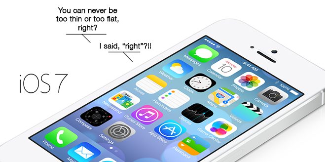
Many complain that it looks like a graphic designer designed it! Wow! Now that’s an insult! As a graphic designer of 30+ years, I had no idea we were so bad at… designing things. Unlike, say, plumbers, I guess (no offense, plumbers). Personally, I was starting to feel that the old/current UI was getting pretty long in the tooth. Hadn’t changed much since its intro in 2007. And, yes, in the pace of the world today, things can look out-of-date in a relatively short period of time, especially things as fluid as software interfaces. Apple has maintained the basic functionality of the iOS (Gas on the right? Check.), but added a ton of more flexible features and improved handling. Side-by-side comparisons of iOS 6 to iOS 7 make the former look overwrought and heavy to me, with the latter appearing much lighter and brighter. I have to say, I’m really looking forward to getting it on my iPhone (most likely on a 5S or 6B or G23 — Bingo!).
Still, it’s interesting and oddly reassuring that people care this much about how a phone’s operating system looks. Apple’s the company that largely brought these concerns to the public in the first place, particularly in tech design. They always cared about the looks and functionality of its devices, and now, apparently, everyone else does too! Passionately. Good job, Apple.