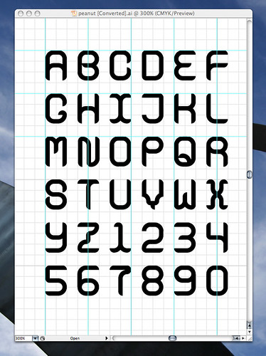
 Even before the first ACDC logo was scrawled on a spiral-bound notebook, kids have been interested in lettering. Whether it’s graffiti-esque scrawls or little pictograms, kids love to create fun shapes and alphabets. What better than to transfer this creativity to the computer in the form of a font?
There are a couple of approaches I’m going to explore. First, the quick, cheap and completely unchallenging way: go to fontifier.com, download their template, draw your letters, scan it, and upload to the site. You can view your completed font online and buy it for $9, and download immediately. The disadvantages are quality concerns (fonts are kerned and aligned automatically) as well as pretty much zero geek cred.
What’s the alternative? Why not create a font the way professionals do? You explore a couple of useful programs, learn some typographical vocab, and your font turns out nicer! To do this you’ll need Adobe Photoshop, Adobe Illustrator and FontLab Studio or equivalent programs. Yes, we’re talking about well over a thousand dollars in software — but you don’t need the latest and greatest to do your thing. All the functionality you need can be had on legacy versions of Photoshop and Illustrator. Often older licenses can be had for a song.
A necessarily vague how-to after the break.
(Before I get started on the Photoshop-Illustrator method, I just wanted to note that you can also get away with simply using FontLab by itself — you draw the bezier curves by hand. But I’ve found it is difficult for beginners to create letterforms in FontLab. It’s far easier to go about it this way:
1) Have your geekkids draw letters or shapes in black marker on a sheet of white paper. Remember, it can be a dingbat font — if the kid doesn’t want to do letters, that’s OK. Even if he or she is designing traditional a traditional alphabet, it’s nice to have a couple dingbats in there for personality.
2) Have the kids start with the letters HAMBURGEVONS — these letters consist of all the shapes you’ll need. For instance, an F can be created from the E. (This is easier to do in the computer.)
2.5) Alternatively, go back to the classics by scanning in public domain letterforms. You can find a lot of reprinted woodcuts in various Dover books like 100 Ornamental Alphabets and Script and Cursive Alphabets: 100 Complete Fonts
. The resultant glyphs can be remixed in Photoshop or Illustrator to add a little creativity.
3) When the kids have completed their letters, scan them in. I find scanning in as a bitmap (as opposed to grayscale) is best because it facilitates cleanup once they’re in Photoshop. Clean them up and trace each letter using the Path feature. For quick and dirty you can get away with selecting all black and converting the selection to a path. However, I prefer the former method because it results in cleaner paths.
Note: FontLab has a plugin called ScanFont that does a lot of this, but this is the way I learned how to do it. ScanFont might be better for younger kids who don’t have the patience for “hard” project.
4) Export paths to Illustrator. Once in Illustrator you can clean up the points and make sure the letters look good situated on the baseline. At this point you can use the Knife tool to cut apart letterforms and create new ones. Don’t forget basic punctuation and numerals!
5) Cut and paste each letter into FontLab. From there you can clean up spacing and kerning, preview the font and export as a font file!
Whee! Your geekkids have a font they can use and give to their friends and family members!
One final note: if you found the above explanation excessively vague, check out the fontmaking how-to by the grand master of typographical homebrewing, Chank Diesel.

