One of my favorite sources of information visualization is Jeff Clark, a Canadian programmer who has been using Processing for a few years to reveal interesting attributes of Twitter content. When a YouTube project ran all six Star Wars films simultaneously in 2×3 matrix, Clark took the opportunity to snag some material for an interesting visualization of the movie series.
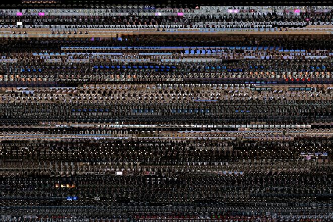
By extracting stills from the videos in one-second intervals, Clark was able to emulate what Brendan Dawes did for an art exhibit in 2004 called Cinema Redux. Each set of images is arranged chronologically with 60 stills in each row, creating a kind of fingerprint for the film.
The end product is a large pattern of colors that show major scene changes and their relative length. The overall movie length translates to height of the composite image. One can easily detect key scenes, like the blue of Hoth, green of Endor and the red of Mustafar. This method of analyzing films is less concrete than a comparative matrix, but it is easy to get a gestalt of the similarities and differences in the cinematography across the series.
Take a look at the results for all six films on Neoformix.